PwC · 2021 · Web + Mobile · Workforce Management
Designing for Compliance at Scale: Optimizing COVID-19 Vaccination Verification Funnel
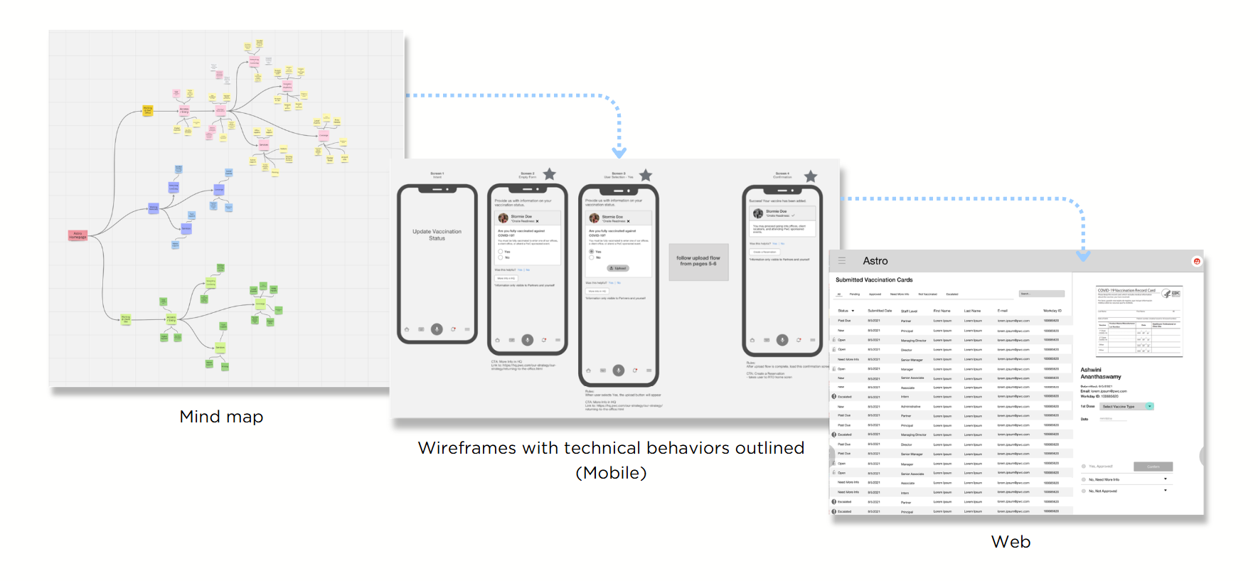
PwC needed every employee's vaccination status verified against a hard compliance deadline, without the flow feeling cold or invasive. I designed both sides of the funnel (the employee mobile upload and the reviewer dashboard) as one system with a shared status model, so neither side was ever guessing what the other was seeing.
The problem
This was something we needed to create from scratch. The vaccine mandate was the gate to returning to the office, which meant every employee had to verify their status before they could come back. We had to stand up the entire funnel from zero: an employee mobile upload, a reviewer dashboard, and the shared status model tying them together. The hard part was that two very different products were going to live or die by the same record, and if their statuses drifted by even one name, the employee would call HR. So the job was to design one shared status model both sides lived inside, before either side existed.
Scope & constraints
Every screen reviewed by legal, no storing the card image longer than necessary
Hard compliance deadline that didn't move
Two very different users on two very different surface: Employee on mobile under stress, reviewer on web at volume
Accessible to employees uploading from a phone for the first time
Approach
- 01
One status model, two surfaces
Mapped every state a submission could be in (submitted, in review, needs resubmission, verified, rejected) and made sure the employee app, the reviewer dashboard, and the notification emails all used the same names.
- 02
Designing the upload for the worst day, not the best
The flow had to work for someone uploading a blurry card from a parking lot, not the demo case. Forgiving image capture, clear retake path, and copy that explained why we needed it before asking for it.
- 03
Reviewer dashboard built for triage, not perfection
Borrowed the mental model from SLA tracking in Zendesk - the software I used during my client service days. Queues sorted by time-in-state, clear aging signals, keyboard shortcuts, and a one-click 'kick back to employee' path that fed the same shared status model so the employee saw exactly why and what to do next. The win was time-per-review, not a beautiful approval UI.
- 04
Legal as a design partner, not a gate
Looped compliance into wireframes instead of saving them for the end. Cheaper to rewrite a sentence on a Figma frame than to rebuild a flow the week before launch.
Outcomes
Status mismatch tickets to HR dropped sharply once the employee, reviewer, and email surfaces all spoke the same vocabulary
Reviewer time-per-submission fell as triage defaults and the 'kick back' path replaced ad-hoc judgment calls
Hit the compliance deadline across the org without a parallel manual-tracking process running underneath
Shared status model was reused as the pattern for the next compliance flow that came through the team
Key learnings
Two-sided systems need one shared status model.
The employee and the reviewer have to see the same state, named the same way, or every mismatch becomes an HR ticket. Naming is infrastructure, not copy.
Compliance flows live or die on tone, not on UI.
The same screen reads as 'we've got you' or 'we're tracking you' depending on three sentences of copy. In a sensitive flow, the words are the design.
Legal in the room early is faster than legal at the end.
Looping compliance into wireframes saved weeks at handoff. The expensive version is rebuilding a shipped flow because no one read it until launch week.
Next project
Design Velocity: Architecting a Scalable Design Ops Engine