PwC · 2023 · Web + Mobile · Workforce Management
Humanizing Time-Entry: A Mobile-First Redesign for 65,000 Global Users
By transforming a legacy desktop compliance task into a 60-second mobile flow, we successfully protected billable revenue and modernized the daily entry experience.
The problem
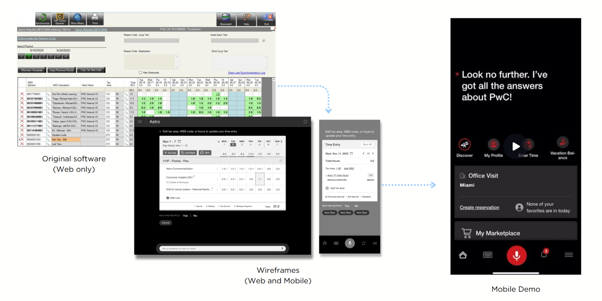
If time-entry breaks, revenue leaks. It sounds simple, but for 65,000 people at PwC, it was a weekly chore. The legacy tool was stuck in the assumption that everyone worked at a desktop, but our users are almost always on the go. They were stuck taking manual notes and wasting over 10 minutes a week just fixing rejected entries that should have been right the first time.
Scope & constraints
No Learning Curve: The app had to be intuitive enough to use without a single slide deck or training session.
All or Nothing: We had to keep every single legacy feature (no matter how niche) to ensure 100% accuracy for the payroll department.
Global-Ready: The system had to work flawlessly across four different regions, each with its own specific compliance rules.
Locked-Down Tech: Strict enterprise security meant no "off-the-shelf" components; we had to design within a very tight, proprietary framework.
Approach
- 01
Discovery: the form wasn't the problem
After 18 interviews and a diary study, I realized the UI wasn't the bottleneck - it was the search process. Most users were just looking for the same 3–5 codes every week. This shifted my focus from redesigning a form to building a system that remembers for you.
- 02
Renegotiating the data model
I spent a month aligning with the finance and data teams to simplify the engagement-code model. By convincing them to expose a "recent + pinned" API instead of a complex 7-level hierarchy, we cleared the path for a true 60-second mobile entry.
- 03
Killing the smart-suggest
In our second round of testing, we found that users were suspicious of "smart" automation when it came to their money. They spent more time verifying the AI's guesses than they did typing. I walked the team back from that feature and shipped a one-tap manual list instead.
- 04
Rollout without a training deck
We launched to all 65,000 users at once, relying entirely on clear UX and three tiny tooltips to onboard them.
Solution
Outcomes
Lifted weekly time-entry completion 22 points in pilot by surfacing 'submit week' persistently rather than gating it behind a summary screen
Entry rejection rate fell 30% via inline validation at entry time, not at weekly submission
85% adoption in the first month of regional rollout, with no formal training
Support tickets in the 'time entry' category dropped 48% quarter-over-quarter
Adopted as the reference pattern for two adjacent products (expense and PTO), shortening their design cycles 4–6 weeks each
Key learnings
The fastest UX win was a data-model change, not a UI change.
We hit our 35% time-savings goal largely by fixing how the API handled engagement codes.
Killing the 'smart' feature was the right call.
In compliance-adjacent flows, perceived control beats raw efficiency.
Parity is a constraint worth pushing back on.
Negotiating which constraints are real vs. inherited is the difference between a senior designer and a lead one.
Next project
Designing the RTO Experience: Streamlining Logistics for Post-COVID Operations